
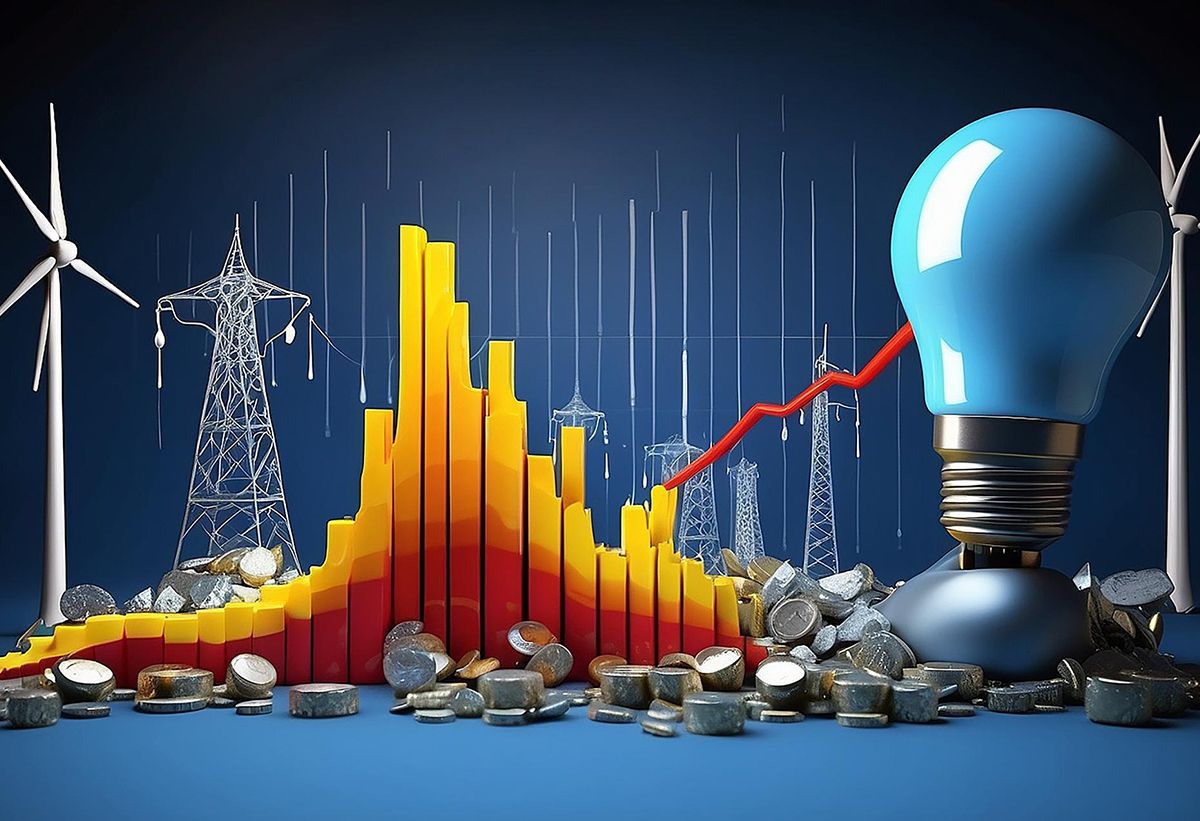
Shifting From Simply Showing Data to Storytelling with Data
EnergiSpeak's approach to leveraging technology for data visualization and storytelling is commendable. Here are the EnergiSpeak approach elements

01. Utilizing Advanced Technologies
-
EnergiSpeak takes advantage of advanced technologies that enable the collection and interpretation of large volumes of data. This technological foundation allows for a more comprehensive understanding of complex datasets.

02. Interactive Dashboards for Storytelling
-
The use of interactive dashboards is a powerful tool for storytelling with data. EnergiSpeak's dashboards serve as a platform to visualize data, transforming it into compelling narratives that drive informed decision-making.

03. Intersection of Engineering and Art
-
Acknowledging that effective data communication is at the intersection of engineering and art, EnergiSpeak embraces both aspects. By adding an artistic component to data visualizations, the information becomes more accessible and engaging for users.

04. Providing Tips and Training
-
EnergiSpeak goes beyond providing tools by offering tips and training on building effective dashboards. This helps users enhance their competency in storytelling with data, ensuring that the information communicated is impactful and clear.

05. Focus on Data Visualization as a Medium
-
By viewing data visualization as a medium rather than just a tool, EnergiSpeak recognizes the potential for storytelling. Visualization becomes a means of communication, conveying complex information in a digestible format.

06. Reducing Perceived Cognitive Load
-
EnergiSpeak places emphasis on minimizing the perceived cognitive load for users. This involves streamlining visualizations to reduce clutter and enhance clarity, making it easier for users to interpret the information presented.

07. Establishing a Structure for Communication
-
Providing a structured approach to communication through dashboards is crucial. EnergiSpeak establishes a framework for conveying messages effectively, ensuring that the objectives of the dashboards align with the information presented.

08. Explanatory Analysis
-
EnergiSpeak's dashboards go beyond presenting raw data. They incorporate explanatory analysis, offering concise insights and interpretations that guide users in understanding the implications of the data.

09. Use Visualizations Strategically
-
Incorporate visualizations that support and enhance the narrative. EnergiSpeak Choose charts, graphs, and other visual elements that effectively convey the key messages and make complex data more accessible.

10. Simplify Complex Concepts
-
Break down complex data and concepts into simpler, digestible parts. Avoid overwhelming the audience with too much information at once. EnergiSpeak Focus on the most important elements of the story.

11. Highlight Key Insights
-
Identifies and highlights key insights or trends within the data. Clearly communicate these points to ensure that the audience grasps the main takeaways from the information presented.
By combining technology, artistic elements, and a focus on effective communication, EnergiSpeak stands out in its commitment to making data-driven insights more accessible and actionable. This approach not only empowers users to make informed decisions but also contributes to a culture of continuous improvement and up skilling within the team.

Combine Statistics And Energy Consumption Principles
EnergiSpeak brings the combination of statistics and energy consumption principles which plays a crucial role in understanding, analyzing, and optimizing energy usage in various domains. Here are several ways EnergiSpeak make these two fields intersect.
Read More
Valuing Energy Management
Valuing energy management is essential for organizations and individuals alike, as it encompasses a range of benefits that contribute to environmental sustainability, cost savings, and overall operational efficiency. Here are key aspects that highlight the value of EnergiSpeak’s high value energy management systems.
Read More
Unlocks The Benefits Of Digitalization In Energy Efficiency
EnergiSpeak solutions ease the Digitalization which plays a crucial role in unlocking various benefits in the realm of energy efficiency. Here are several ways in which EnergiSpeak digitalization contributes to optimizing energy usage.
Read More
Enhance Energy Management Information Systems (EMIS)
EnergiSpeak's enhanced Energy Management Information System (EMIS), leveraging the latest AI/ML technologies, offers a comprehensive solution to monitor and manage energy consumption for improved efficiency.
Read More
Steering System Integration of Renewable to Net Zero
EnergiSpeak addresses the challenges posed by the inherent variability of wind and solar PV power generation to achieve Net Zero targets. Here's how EnergiSpeak realigns energy and climate goals.
Read More
Consolidates an IT Approach to Energy Optimization
EnergiSpeak consolidates an IT approach to energy optimization involves leveraging Information Technology (IT) tools, systems, and strategies to enhance efficiency, reduce energy consumption, and contribute to sustainability goals.
Read More
Shifting from Simply Showing Data to Storytelling With Data
EnergiSpeak's approach to leveraging technology for data visualization and storytelling is commendable.
Read MoreWe drive the transition to more sustainable, reliable & affordable energy systems, Find Your Solution

Ready to fuel your curiosity?
Dive into the future with EnergiSpeak!
Embark on a journey of knowledge and innovation by subscribing to our newsletter. Stay at the forefront of groundbreaking developments in human ability, energy domain, and technology. Our newsletter is your gateway to insightful content, thought-provoking analyses, and exclusive updates, carefully curated to keep you informed and inspired.